Seoul Metro Map
Visual Design
Overview
Modern cartography comes in all shapes and forms. This is a self-initiated challenge to create a complicated map in a unique and functional layout.
Featured in: Cartographics: Designing the Modern Map & All About Maps

Final design revised for publication, 2015
Inspiration
Obvious place for me to start was to look at the current map of Seoul. I picked the city Seoul not only because it's where I'm from, but also because the complicated nature of the city design allowed for a variety of visualization methods.

The original Seoul Metro map

Traditional Korean patterns
Process
I noticed that the green route actually runs in circle. So I prepared a circular plane that I can place the stations onto. After placing all of the stations in its relative direction and distance, I connected all the dots to create the map.
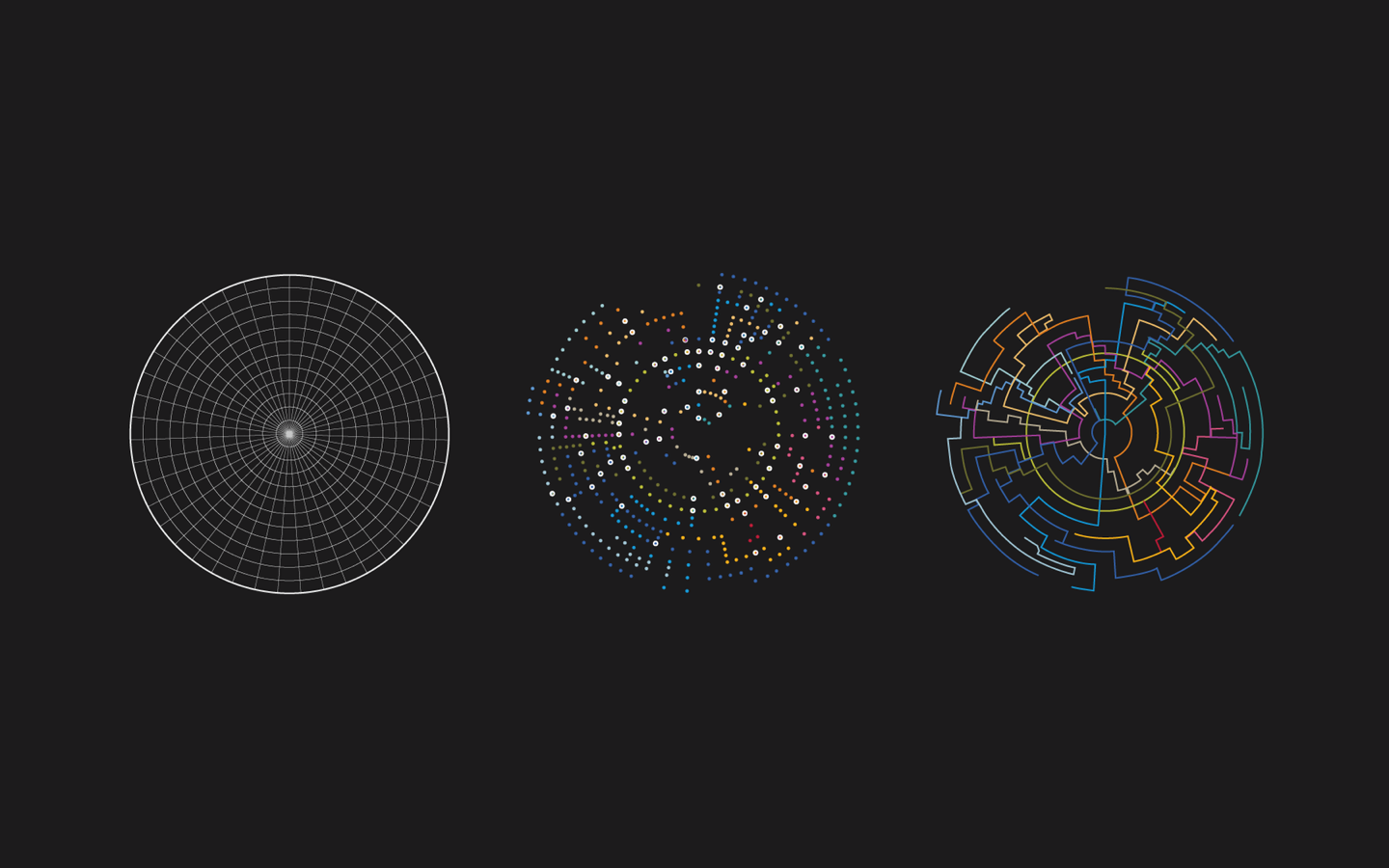
Process: Draw a circular plane, place all the stations, and connect the dots.

Station types based on the number of connections


Logo design: Using the negative space to create an arrow

Logo application (metro card)

Iconography

Brochure Concept
Initial Approach
This project has gone through multiple iterations. Some iterations were as extreme as starting everything from scratch. As you can see from my first iteration below, the colors I used were less saturated, iconography set was less refined, and craftsmanship leaves a bit to be desired.


Comparing to the original map, it's still functional
